#8 Arbitrary Maps: Magic other than the wand....
Why?
The catalyst for this KPT file was a series of messages in the Photoshop discussion area on AOL, with people first wondering how to do it, then suggesting certain methods such as the wand and then me opening my loud mouth about it. To a call of `yeah then tell us how to do it if you're so smart'. I guess I had that coming.
So I pulled this ahead in the schedule (in fact I had started KPTs on the `Arbitrary Map' and `Coloring' in different contexts). See, it pays to post questions! (needle, needle, guilt trip...)
What?
The problem posed is rather a universal one. You import an image with specific colors, say an Illustrator file with X number of spot colors, or a scan of such an image printed with traditional means (silk screen, etc).
How can you separate the individual colors? And then of course, once they are split, visualize each in its own color, process them one at a time, save/print/transfer them individually, and finally also....put Humpty-Dumpty back together as well...?
In fact, once you know how to do this, it applies to a minor myriad of situations. To isolate a color or range or objects is a rather basic tool.
How?
1) Ok, let's start with a sample image. In a pinch the trusty elderly gentleman has proven to be recognizable even in tiny sizes and oddly mutilated, so here is Albert in a 5 spot color version. I will do this at first in grayscale. In fact the separation process has nothing to do with the colors anyway. If this had been a full color image to start with, I would suggest to duplicate the RGB image and convert it to grayscale first. Then we'll separate the grayscale into components and later they can be used as masks to extract the actual colors out of the original image. There is no advantage to stay in color, in fact it just slows things down and complicates matters. Some Arbitrary Map functions won't even show up in color...
fig 1) 
Albert in 5 spot colors, converted to grayscale (b&w plus 3 shades of grey )
Note> Image > Calculate > Duplicate the image before each of the isolations! You will lose the `normal' during the conversion and need to start fresh each time. In this case you need 5, plus a spare original. I have a macro `option-d' duplicate (Quickkeys) that I just hit 5 times (includes the "Ok' button click)
2) Now the immediately `obvious' tool that springs to mind to isolate a shade is the Magic Wand. One would tend to jump right in and click on a shade to select it, as shown here:
fig 2) 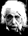
Using the magic wand to select a region, (here the eye)
In order to do that, one would double click on the wand and in the dialog select "1" as tolerance and "no anti aliasing", then a single click on the eye gets the selection `marching ants' (in the picture, the wand was moved away a little, the click was on the eye). So far so good.
Trouble is, that although one can select multiple regions (e.g. the other eye) by clicking on them with the Shift key depressed, it is a very time consuming manual task. If the desired region includes a lot of single pixels dispersed across the whole area one can use the Select Similar... option, but what exactly is included in the selection will have to be tried and re-tried with the sensitivity settings. The following technique can include a color with near anti-aliasing colors and do so in Real-Time:
3) Alternative Magic method: Launch Image > Map > Arbitrary... which I am sure you have mucked around with a few times and marvelled at the instant middle late sixties type pop-artsy effects. Well there is more to it than that. In fact soon you will marvel at the instant early nineties type usefulness.
fig 3) 
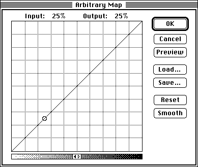
The Arbitrary Map dialog
Right off the bat an important and often overlooked feature: As soon as the cursor moves out of the window and back onto the image, it will change to the `eyedropper' tool ! In fig 3) the cursor is pointing to the light grey shade on the cheek. Notice the effect (and the reason to do this) : It points out where exactly that shade is located in the Arbitrary Map! Note> works ONLY in grayscale, not in RGB!
To backtrack for just a second: the window has 256 pixels representing the 8 bits of grayscale in PS. Every Input shade of gray has a corresponding X location (white at the far left black at the far right) and at a correlated Y location a black pixel determines what Output shade of gray is mapped there (white at the bottom black at the top).
As long as the Arbitrary Map is the straight diagonal shown above, each input shade is identical to the output shade = nothing happens. (The "Reset" button will get you back to this).
4) To continue first with the eyedropper, here are the five shades in our image, selected by clicking on points A-E, and then the corresponding points on the map:
fig 4) 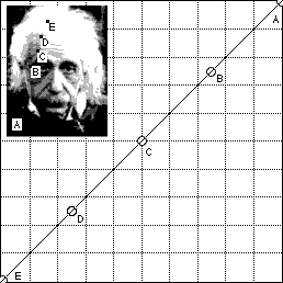
Clicking on shades with the eyedropper and observing the corresponding point in the Arbitrary Map
5) Here now comes the magic. Let's isolate one spot color, say the light grey on the forehead at point "D". We see it falls in the middle of the lower left quadrant on the map. As soon as the cursor enters the 256x256 rectangle in the A.Map it will change over to the pencil, allowing you to draw a new Y location for each X. This means a new output shade for every one of the 256 input shades. To isolate the shade at "D" we simply turn all the other shades to white by drawing a solid line at the very bottom of the A.Map...
fig 5 a) 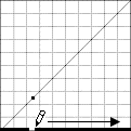 fig 5 b)
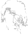
Isolating the spot color at point "D"
Just be sure that all pixels except at "D" are at the Y=0, the far bottom.
Note: The line is exaggerated in fig 5 a), it would be single pixel thick and, even more important, the Mapping operation will not look as you may expect until you hit the Preview button!
Voila, what remains is every last little pixel of that particular shade! And realize that it would do this even in a gigantic 3000 line image in near realtime (Compare that to the old wand method)
It is really quite brilliant...
Note: In our example you don't even have to come very close to the pixels at point "d". Since there are only 5 colors, each occupies ca. 50 pixels on the map and you can be rather rough with the line at the bottom. If there are truly 256 shades in a contone grayscale image, each one would have an effect!
Tip >>> You could use "Posterize" = 64 or something near that, to reduce the number of shades in such an image. This is recommended before other magic wand type actions as well.
6) Lets do this with another spot color, the dark grey at point "B". We take another one of the 5 duplicated clean originals, enter the Image > Map > Arbitrary... dialog and draw a line at the bottom everywhere except around the range of pixels at "B". Click Preview and tadaaaa, isolated spot color...
fig 6 a) 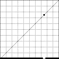 fig 6 b)
Isolating the spot color at point "B"
Important additional point here. If you want to work with color (but also in other tasks extracting features), what you are really trying to do here is to create a mask! You can use this mask in the compositing process via Image > Calculate > Composite, worthy of a whole KPT unto itself. The short summary would be: Where that Albert in fig 6 b) is black, use image X (flat red, gradient RGB, wood, noise, Lincoln, whatever....) where fig 6 b) is white, use image Y (green, Hue, marble, blobs, Quayle, whatever...)
Well, maybe not Quayle.... Anyway, in the Composite dialog Image X would be called "background" and Image Y "foreground", fig 6 b) is the "mask" and they all have to be the same size...Read KPT #1 and #2
If the object of the isolation is to create a mask, then it is advantageous that the mask be solid black, other wise a translucency factor will creep into the compositing. That can be used purposely with great effect, but for normal flat collage type composites, keep it solid.
7) You could turn a mask such as fig 5 b) or fig 6 b) into black and white via the Levels...dialog, or even just simply with the command -e Equalize command, but while you are in the actual isolation process you are only one step away from accomplishing this quickly: In the example of fig 5) the grayshade is at height "d" corresponding to the light grey. After you turned everything else to white at the bottom, simply turn the "D" region to black by drawing a short line at the very top=black....takes 2 secs....
fig 7) 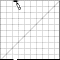
Remapping the isolated spot to become black, perfect for use in masks
Note: To turn an image like this into black and white you should not use the Brightness dialog where shades constantly interact. Get more familiar with Levels...it is much more precise and a true superset of Brightness. Certainly don't convert to `bitmap' as I have seen people do, merely to get b&w...
8) Some more notes on the Arbitrary Maps included in this archive:
As part of this archive you will find a folder full of Arb.Map files loadable in the Arbitrary Dialog. Note that while the names reflect approximate mnemonics in images with continuous tone, the effect will vary a great deal depending on the image to which you apply them... It ought to give you at least an interesting variety of starting points to experiment.
Included is among others the "z" banding map mentioned in the Instant Sphere document. (the gradient spheres are good source images...)
Tip >>> As with most "preview" commands in Photoshop, the realtime nature of the dialog will seem to be lost (especially on 24 bit cards) after the first application of Preview. This can be restored simply by an `Option-key depressed' Preview...
In color images, the Arbitrary Dialog will load and save only the Master map, not each R,G,B map. The eyedropper lookup feature cannot be applied as each falls to varying degrees into the 3 planes. It is interesting, though, to load a map such as the Hard Zebra, which creates sharp bands and then successively use the Smooth button and Preview each iteration.
In fact this is a very intriguing way to colorize monochrome images, by converting them to RGB and then loading these Arb.Maps, plus modifying the individual R,G,B maps by hand. Use Smooth to keep continuous tones and non pixellated transitions. (I wish Smooth weren't quite so high-q to have more steps)
Another short abstract of a more complex topic: (while we have these in front of us)
To colorize each layer into the actual spot colors you can take the mono versions above and convert each to Mode > RGB Color
Note: On 8 bit systems this yields dithering with full 24 bit integrity inside. Still, the dithering may make this a bit tricky, visually. You can convert to Mode > Indexed Color, 8 bit Clut images, but none of the filters and smooth edge tools will work after that...Best to stay in 24 bits, even save it that way, and get the best preview at the end in a final conversion from RGB to Indexed Color...) I recommend a 24 bit card as one of the first things to upgrade to.
Then you go to Image > Adjust > Hue and select the "Colorize" checkbox. Now the sliders will change hue, saturation and lightness in realtime (Version 2.0! this has changed a great deal between versions! In fact the hue calculation is much faster in 1.x, but 2.0 offers more control by adding the lightness as well as individual color control for R,G,B,C,Y,M...and you can eyedrop a spot color. This is another full KPT though...)
Anyway, it's a fast way to see each layer in its true color. To match the exact value, simply open the Show Info windoid and via the eyedropper read the values of the original color image (Tip reminder: you can have both windows open and the eyedropper gets colors from the second window without selecting it!) and then in either Adjust > Levels..., or Color Balance match the numbers.
I recommend this highly over using fill bucket type operations!!
I know half of this makes very little sense while reading diagonally short story style...If you are in the middle of doing this, it will suddenly pop to life as actual meaningful sentences. Albeit still a bad novella.
Here are all five spot colors isolated into separate documents, with the original for comparison. The value of this technique increases with more colors and sidebands. e.g. when a 5 color picture is scanned or other wise anti-aliased. If you really only have totally flat shades, you can use Select Similar and then Save Selection into other channels.
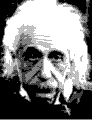
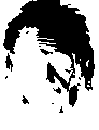

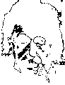
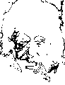
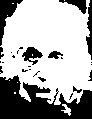
fig 9) the original and 5 spot color components after isolation.
I guess to put this all back together, in color, is another document. Anyone who has problems with any of this, send me a note...
You might also find interesting variations on the technique or weird hidden option command tab secrets. Post `em...
PS:
You could add a note in the feedback folder mentioned at the top if you have results to share with others.
There is also a less-than-a-minute-download feedback textfile I'd like to get back for further statistics and just to find out what you do, where and how and why and with whom. And so far tons of you have downloaded it but not sent it back-You know who you are!
Shame, shame. Now what if everybody did that!
Please let Compuserve and Adobe know if you find these tips useful.
To me, they are utterly useless. I knew this before I started typing....lol
Happy Photoshopping, Kai Krause
By Matthias Müller-Prove. Modified:
5/1/20
