#23 Complexity-city! The Snowy Mask Technique
Why?
Can you say hypocrite?
Once he preached on some high horse about sharing your special knowledge without delay before someone else turns it into a single button. And then what did he do? He sat on his special knowledge like the worst of them, and to top it off, even hoped to beat himself to the finish and be the one who turns it into a button, too. Ouch.
I came around though, and after I first taught the technique at various seminar situations, this is the inevitable next step. This one was one of my favorite techniques, the kind of thing I'd try first when given the task of making a new logo. I'm giving all away (choir, harps...)
It leads to many new areas in that special way I love so much: the outcome of the process you are steering here is literally not doable in any other way and you would have a VERY hard time achieving the effects even as an accomplished painter. I won't be able to upload the very large art files I used it on, but you can find traces of this in many of my pieces.
It will be fun for me to see it emerging from other brains and hands in some mutated side branch.
What?
I call it the Snowy Mask because the basic notion is to create masks to separate elements and areas within any logo, text or other shape. Its trivial to select edges for instance, but this technique will subdivide a shape into amazing and complex structures, but no matter how wild and woolly they get, they are related visually to the original shape and that's....hard to come by otherwise ; )
Give it a whirl.... it will give you a swirl or two.
How?
As always, it's not about following this sequence `comma by period', I'm not Simon and you're not some parrot, so get a grip! Try to get the gist of the `what and why' first, then go forth and create your own oeuvre.
I don't think it's necessary to explain here again just what Channel Calculations are or where the `Duplicate' command is found, etc... If you do need more basic introductions to these things, try out the previous 22 chapters...#1, 2, 17, 18, 19 are all about Chops and are sprinkled with the basics (even though I'd write it all differently now of course, in the beginning I had no idea it was all going to get this far out of hand).. Anyway here goes:
1. I am starting here with a 600x400 grayscale window and slap some text in there, like at 222 points.
antialiased..blablabla. The teeny redux version looks like this

Fig 1. The start, plain text, font and stuff: your choice
2.. Next, as usual in the beginning of a lengthy Chops series, make a duplicate copy (control-d is a good key for a macro to do this all the time), it will appear in a new window, same dimensions.
3. Use Filter > Gaussian Blur on this one, here I set it to "15". I will discuss the pro's and con's of higher and lower values in a minute below.

Fig 2. The copy in a new window, G.Blurred at 15
4. Duplicate this blurred version once more...you now have three copies
5. This second blurred one needs to be offset a little...so use the Filter > Other > Offset dialog and set it like this...
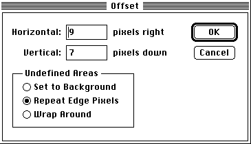
Fig 3. Offset the second blurred copy a little...
(Putting the same number in horizontal & vertical creates an exact 45 degree displacement which can contribute unwanted artifacts) (Repeat Edges is the most benign choice in most situations, in this case it would look the same with either of the three...)
6. Uh oh, I feel an Albert coming on... here comes the heavy theory bit... (put on your heat belts)
We are going to use "Difference" channel operation now. The idea is very simple, put two source images in (they have to be the same dimensions, which is assured by the duplicate process) and out comes a new image containing literally the difference, pixel for pixel. If the 245th pixel in Source 1 and 2 are totally identical, that 245th pixel in the new document will be black. If they are completely different ( eg 0 black in one and 255 white in the other...) then the new pixel is white. In between grays are generating corresponding shades of gray. So far so good.
By implication, if Source 1 and 2 are identical, the resulting Difference will simply be: nothing, all black.
And sure enough, we duplicated the two pictures and that's what we would get.
Except, in step 5 we did offset one just a little and that means they won't totally annihilate one another! Certain portions will be the same of course, but near the edges things won't cancel out and white areas appear as a result, toward the center of the shapes however commonailty will tend towards equalizing out to black again. Its a little dance that is played out by the shapes...
Lets see how it looks:
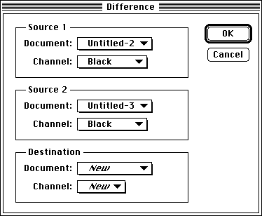
Fig 4. Creating a new window with the Difference between the two blurs...
7. And here is the by-now-expected result:
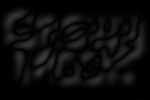
Fig 5. The Difference Chop result in the new window
Mostly black, soft grays around edges, black again inside....
8. But the magic that earns it the name Snowy Mask is coming now, because similar to the Electric Aura effect there are some amazing things lurking in here, which we now bring out using the Levels... controls.:
The idea is to re-map the shades.... In the end what I am striving for here are clean anti aliased lines,
zipping through the shapes, bisecting them at times, swirling in and out at other times.
In this diagram the mid points of these glowing swirls ("1") is supposed to be a solid white, the area inside the shapes but outside the swirls ("2") should be solid black.
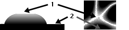
Fig 6. A crosscut and top view of the `Swirly Glows'
9. The first thing to set in Levels (an actually little known featurelet)...the two Output Levels triangles can be made to cross one another and achieve an instant `invert' operation. ( Sure, the second image could have been inverted via command-'i', but this way the whole thing is one step and un-doable as such.)
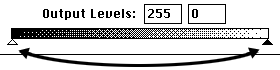
Fig 7. Levels...: doing an invert on the fly by swapping triangles...
By the way, as you cross the triangles and you have video LUT animation set ON ( in General preferences, lower left corner in 2.5.1, you SHOULD have this ON, much faster preview via Gamma) , the dialog itself will turn black...do not be alarmed by this, its a perfectly fine aspect of previewing the inverted state...( I will of course get mail from some moron that I broke his system with this and he will of course be published in MacUser saying this)
10. In my example, the numbers to achieve the effects in 8. are as follows:
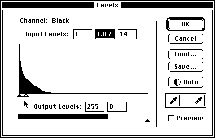
Fig 8. Remapping the shades of gray to achieve the proper Snowy mask....
11. And here is the final form....glowing swirlie thingies and all:
The name can maybe now become more logical, maybe not.
To me the areas in white ("1") are the `snow' and an inch below that is the black rock ("2").
Of course it has nothing to do with snow and rock, its all about visualizing the shape of the final mask. 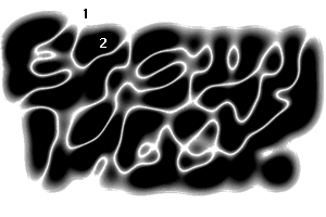
Fig 9. A Snowy Mask for the text "Snowy Mask"....
Considering how boring the original shape was, 10 plain characters in one font in solid black..., I find the resulting complexity quite intriguing every time I do it. You can't read the text at this stage, but PLEASE don't dismiss this for legibility...that's not what its about!
We'll see in a minute how the mask can be applied in various ways for killer results.
12. Before we go on: it is quite clear that there are many settings in the Levels dialog that can greatly affect the shape of the lines...here is a variety of examples. You cannot simply set it to fixed numbers, the mask has to be judged on an ad hoc basis for each image.

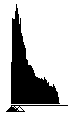
Fig 10 a) Triangles at far left, thin lines, sharp sides

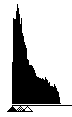
Fig 10 b) Triangles moved further apart, flaring smooth lines

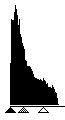
Fig 10 c) Triangles spread, wide soft glows
13. The other variables in the process are the amount of Gaussian Blur and the extent of the Offset.
Less Blur will result in smaller cleaner features.

Fig 11) With smaller G.Blur, the "y" has finer lines bisecting it...
No blur at all however creates mere pop-art Vassareli double shapes ( although this can be entertaining if you happen to walk in Vassi's shoes)
Too much Blur (above 20 normally) will generate artifacts, this is not too hard to understand: the Histogram in figure 8. will be reduced to a tiny wedge shape since most areas are substantially the same and cancel out. Forcing those few dark grays via Levels can only be done at the cost of artifacts, i.e. fuzzy edges.
Same with the offset. If too small, there is simply too much commonalty between the Difference sources and trying to extract the snowy mask will be very `raspy'. In fact you can rather try more generous offsets, e.g. 30/25...to get very clean smooth shoulders...
If this finds your approval, a modification to the algorithm would be to make TWO blurred copies, offset both in opposite directions at half the setting. This way the larger separation is achieved and yet the resulting glowing swirls are still registered with the original shapes.
Obviously the offset does not have to be in the right/down direction. You can enter negative offsets and position it in any direction. It can be very interesting to have two snowy masks in different directions and then combine them in cruel and unusual ways.
14. Let's get into the variations, where the real action is:
I'd like to point you into a few directions from here, even if I can't create the step by step scenario for each and every one (and I don't really want to even, you guys ought to be your own pioneers!)
You will have to follow the other chapters on channel operations or otherwise be really good with the composite, blend, add/subtract, multiply/screen, lighter/darker and difference commands. Simply put it is rather straightforward to extract specific detail bits and pieces out of any intermediate step.
The snowy mask for instance can be used so that in the dark areas you get one image, in the white areas you get another. If the original clean shape is used as a mask then you can add the glowing swirls inside the shape and the displaced blur outside of it. With some cleanup and edges here is what that looks like:
Fig 12. Inside original text is the snowy swirly stuff, outside is the blur shadow
(Fig 12. was not just a plus b, so don't try to get that in one step and wonder what you are doing wrong...)
And once you have isolated a part you can colorize it separately of course (download size prevents me here to show full color examples).
15. Here is a good example: If the offset gaussian blurred image (after Fig. 3) is subtracted from the snowy mask in Fig 9 you effectively extract only the "inside flame swirls"...:
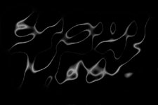
Fig 13. Subtract: Source 1 = Snowy Mask Source 2 = offset blur extracts the flames
This is not only an interesting graphic element all by itself...( remember that this is only some random lame piece of text...you have no idea what comes out with your logo or your clients name in some really cool font...!) but it can also EASILY serve you to do the extraction business..!
Lets say you like the basic fig 12. as a masthead or something and now you want the flames in fig 13. to be red overlays... e z :
First convert 12 to RGB so it can accept color. Then simply use Duplicate Fig 13 and as the destination select fig 12., however in the Channel popup instead of RGB choose "Selection".
This means that whatever is WHITE in the Source 1 document ( here the flames) will be a floating live selection in the Destination document. ( note that this does NOT copy anything from Source 1 at all, it merely takes the white areas as selected, the black areas as opaque masked, and the grays in between...)
Fig 14. How to let the flames in fig 13 come up as a floating selection in Fig 12, ready for colorizing
If you wanted to select the original text shape, you could use Fig 1 as Source 1, but click the invert checkbox, since the text is black on a white background.
If this is not already second nature to you, I strongly suggest you read it a few times while doing it for real within Photoshop...its one of the most useful basic techniques, which I often find mysteriously unknown amongst avid shopaholics.
Just as a reminder: this whole tips thing is NOT meant for reading in the bathroom or while driving or on a lunch break under a plate of mashed potatoes. If you can at all, try to read `n play step by step, or else many of the little details will escape you.
Trust me, it may look like " yeah sure, gottit, been there, done that..." to you, but its an entirely different story when you do it in high res with a shape of your own design and you peek into all the side branches.
16. To give ourselves more ammunition, we need more shapes and ingredients for further Chopping.
Simply reversing the Sources in Fig 13 will do it!! Check this:
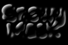
Fig 15. Subtract: Source 1 = offset blur Source 2 = Snowy Mask extracts the glow
Very cool, you now have a gaussian soft glow which is confined to the dark areas of the original snowy mask... This can be used for some great enhancing and soft color/hue changes or inverted can become a different type of drop shadow. If you squint a little you can make out the relationship of Fig 15 to the original text...and think of how to relate them graphically. With other fonts and wider spacing you can even let these techniques become their own brand new fonts in and of themselves! I can easily see Mondo or Wired using such cutting edge font designs...
If you ever make a whole alphabet with snowy masking, send me a letter. ... as it were... : )
17. Here is one mutation further down, using another calculation mode: Lighter... combining the blur and the snowy mask in this mode will choose the lighter one for each pixel in the resulting image. There are various inversion options of all parts of course. By the time I arrived here, I had 81 Untitled windows open...so I may at times arrive at results that look different than if you only make the specifics covered here.
What's cool about the effect as seen in Fig. 16, is that it can look very layered, like fog rolling in over your artwork... A rare graphic stylistic element, because it is so hard to achieve otherwise.
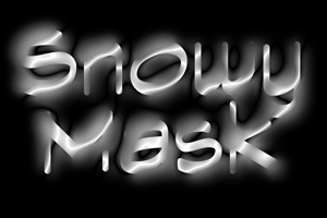
Fig 16. The Lighten calculation mode combines the blur with the font
BTW, this also explains why I rarely do this technique as channels within one document.. First and foremost the 16 channel limit, but also viewing and saving separately is of great value to me. Another advantage often cited is to have Resize affect them all at once, and although I rarely do that, it can easily be achieved by Merge Channels to Multichannel, which is extremely fast.
TIP >>> to NAME your separate "Untitled" windows quickly...merge them into one multichannel document and name them as channels. If you then split them into individual grayscale files again, the names will survive!!! Have not seen that published anywhere
I do often merge the most useful ingredients e.g. clean start mask, snow, edges, etc... and then save the whole source soup as a big "xxxlogo.MULTI" file. ( in Photoshop 2.5 format...which is now also run length encoded = losslessly compressed. This alone was enough reason for me to switch to 2.5 since in 2.01 the PS format did not compress and multi files were gigantic!
18. Further along combinatorics to create more building blocks. Here is a very cool foggy haze drifting over the original text (there are several ways to get this and similar ones like Lighter.. between the shape and the snowy mask will get there). The fumes here are still related to the shapes and have a natural chaotic structure.
Believe me, YOU CAN'T DRAW THIS. A few of you can draw better fumes maybe, but even those would have a hard time if you repeat the technique at 4000x3000 (!)
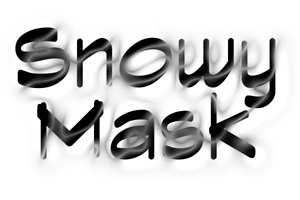
Fig 17. Combining the swirls with the logo results in "Fumes" drifting nicely
19. Reversing the Font image (here after other steps for texture) and using the swirls isolated over that , you get very nice dancing flames ( especially if you colorize them separately)
Fig 18 could be done with the swirls in 13 as a mask, (where 13 is white you get 13, where its black you get the inverted font) Or another Lighter.. combination can achieve this.
I trust that your sense of Sherlockness will be challenged enough to snoop around.
My favorite e-mail messages are the ones where `on the way to get Fig 18 , which I never found, I came across 33 others though...and this one is on the cover of TIME this week...thanks" : )
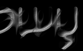
Fig 18. Reverse text and Swirls-only, in Lighten... makes hot dancing multilayer flames...!
20. As further building blocks for your mixture-torture-feast you can also take any lame intermediate windows and instead of deleting them, fill them with a simple gradient for instance.
If you delete any bad ones, and have dozens of such masks, blurs, edges, backgrounds, flames and snow and who-knows-what littering your screen.... ( remember to make a macro that reduces the size to a 1:8 thumbnail so you can see it all...the fact that the Chops dialogs are movable in 2.5.1 is very cool...and don't forget that hide edges, zooming and such keyboard stuff works while you are inside the Chops dialog like composite or even Levels....) anyway, when you ultimately have 30 or more of the beasts ready for your mad scientific experiments, there is no law against playing with the dice (Albert did not say that YOU wouldn't use them, did he...) and try RANDOM combinations.
Here is a random Untitled 80 as a mask and Untitled 22 as Source 1 and Untitled 38 as source 2.:
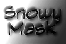
Fig 19. Who the %&^@%#$ knows how this worked...?
Its...fun, its...weird, its....endlessly surprising.
You will rarely find a finished masterpiece, but you WILL find really interesting bits over here or a nice edge over there or a good background reminding you of your first-grade teacher's wart.
Since you know you can learn how to keep these jewels and discard the rest...you are in business.
Call it "Bob's Algorithmic Painting, Inc." and churn out the logoids all up and down your hometown, all happy 90's looking hipper than ever, more MTV than MTV is yet...
Send me the final output examples, keep the cash. Some deal.
21. You don't have to use the mask as a visible feature itself, but as a way to subdivide the shape into sections! In fact the more subtle uses of all this is what I really sweat you can imply. I often need to show the over-the-top psychedelic-looking brute-force examples (and I don't like drugs or force..hm) in order to illustrate the top of the tip of the nice berg. The below the waterline bulk is for you to dive into, so to speak.
(Yikes: here came a large color example of a Roger Dean font. In fact I had to take out 5 color images since it would have pushed the download time to over an hour... )
I cannot stress enough this particular quality of the algorithmic painting approach: anyone may be good enough to paint one letter like that, but to affect the other dozen to look naturally the same is very hard indeed! Worse yet, in high resolution you may see only part of even just one single character at a time...and in zoomed out mode, while it affords you to see the entirety, all your tools are tiny and behave oddly. Getting it just ever so slightly wrong can be detected instantly as `dilettante' and this is one reason why you very rarely see such custom complex effects drawn by hand...
Hmmm, I had hoped to continue here with the more complex color examples of snowy masks...but alas it has become already annoyingly large as it is. Downloading these tips on the dozens of sites they are found on is still the primary method of distribution and I have to remain aware of the time and cost penalty involved. Maybe I can upload a separate file containing only color images for the deeper interested, the deeper pocketed or the deeper desperate.
On America Online, still the major original source and home for these, we not only have passed 40,000 cumulative downloads of the tips n pix by now, but we are also running a full time forum for this stuff as well as my filters. I won't mention them explicitly here though, this always was and shall remain an altruistic non commercial venture... If you would like to use the tips on your BBS, you are welcome. If you think of including them in your next book opus, you can be sure I will say `sure' and won't require any payments.. it happened often enough this year. It would be nice to hear about it or see the final results, though. I have been somewhat surprised how often lectures include the material or special ideas sometimes verbatim, but as if they never existed before until "he" just invented it.
I'm not the litigious type and often I merely chuckle. The stuff is FREE for god's sake, at least they can pay that price...?
Well, its not a problem.
The recent fires up here in the Malibu mountains defined very nicely thank you just what one is supposed to mark in one's brain as a REAL problem. Even though it got to within feet on several sides of the house, everything survived ok, my wife and children and even all the `stuff' is just fine. Before I get hundreds more letters about details than I already got ( thank you though!), I did post a long anecdotal account of the events if you care to read it... It lives in the keyword "kpt" section on America Online, in the Blue Sky folder (where we bare our deep stuff, some nice unusually rich content hiding in that one...check it out). Scroll back to the early November threads...
I hope this #23 may serve as a gateway to more activity in KPT files for me. I have had a lot of big fish to fry this year, traveled 7 times to Europe and 3 to Japan (OUCH OUCH OUCH HELPPPP), the company , HSC, grew from 8 to 45 and we are working on more products than I can count comfortably. Still, this is where much of it started and I would dearly like to get back to it at times.
It would be nice to see more of you readers in person at events like MacWorld, too.
Even with a dozen books and CDs out on Photoshop now ( when I started there was ONE), I hope to be able to still come up with new stuff that has not been published anywhere. At least I'll try, so wherever you get these things, keep looking for more every few weeks or so...
Greets from the moonscape up here, and I'll leave you with a little excerpt from the first page of the fifth part in the trilogy "Hitchhikers Guide to the Galaxy" by the brilliant Douglas Adams.
The connection to KPTs, ( aside from the factoid that a Snowy Mask induced image just may grace the cover design soon, proving a practical side to this whole document ) is in its content:
"Nothing travels faster than the speed of light with the possible exception of bad news, which obeys its own special laws. The Hingefreel people of Arkintoofle Minor did try to build spaceships that were powered by bad news but they didn't work particularly well and were so extremely unwelcome whenever they arrived anywhere that there wasn't really any point in being there."
By Matthias Müller-Prove. Modified: 1/31/14
